When I started to prepare for publishing my novel, Flash Crash, a vast array of logistical issues reared their head. As I came closer to actually releasing the book, I learned the truth of why it’s very hard to self-publish successfully. Every author needs an edge—and hopefully the writing itself is one to begin with. But that may not be enough. One inherent conflict for the average author preparing to publish their own novel is that its difficult “tell great stories” and to also conquer the learning curve of “formatting a novel,” “designing a cover,” “fostering a social media following,” “developing a website,” and “marketing a product.”
Strong experience or a particular skill in any of those elements will help your average self-published author immensely. But in the end, it doesn’t matter if you’re doing the work yourself, or if it’s a graphic/web designer that you’ve hired. What’s most important is that you’re holding the work up to the highest possible standard—applying objective criticism and deep thinking to the fundamental nature of the product.
Today, I’m going to focus on cover design. The cover is vitally important. The reason that I’ve reached some of these thoughts and conclusions was due to the design and subsequent redesign of my own book cover. First, I’d like to show you the first version of my book cover:

I was super proud of this cover. It was ultra bold and in your face. There was a lightning bolt. It even had a “bad guy” with a tattoo of a scorpion on his scalp—both a literal and physical description of one of the antagonists within the novel.
And at first, most of the people that I showed it to were complimentary. A few loved it. Most liked it. Some were on the fence. But then I began to receive external comments. An early reviewer read it on NetGalley and noted that the book was “better than the cover made you expect.” Others echoed her view. I took it all to heart, and I started thinking about where I could improve. What did it really come down to? A lock of focus? Were the words too bold? Was there a problem with the story on the cover?
What should a cover really look like anyways? What is it that people are going to want to click on?
When I first think of covers I think of Hardy Boys books, because they were the first “series” that I read actively. Somewhere around third grade, I read an entire shelf full of Hardy Boys. Check out what Hardy Boys covers looked like:
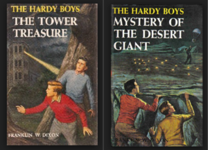
They were very literal and to the point. The cover depicted action from the book. It gave you a glimpse into the story. And Hardy Boys, while aimed at YA males, represented the cover zeitgeist of the times. First published in 1927, their prime was the 1960’s.
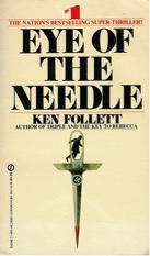
From the sixties to the seventies and into the 80’s, graphic design experienced many shifts. It started with the literalism of Hardy Boys. Then cubism and post-modernism arrived. Art deco flickered up and down in leaderboard, and finally the eighties ended with a combination of all of this—creatively laid out text, hand-illustrated feature or images. Check out “Eye of the Needle:”
Followed by “The Bonfire of the Vanities:”

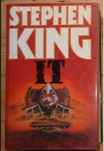
And then “It:”
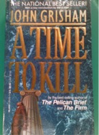
The 90’s were all about John Grisham, Michael Crichton, Tom Clancy. Oh—and one more participant: Photoshop. One need only to look at Grisham novel covers, from “A Time To Kill”…
…to “The Partner” to witness the progression.

This series of developments occurred and eventually began to include fully computer-aided design. That’s the point when we reached pure photorealism, such as the cover of Dan Brown’s Angels & Demons:

In the process of researching what books were selling on Amazon, and general bestsellers, I realized that another progression in book cover images was well underway. The Angels & Demons-period is gone. It seems as though special effects and photorealism have fallen out of fashion. No longer are designers or readers interested in the “capturing” of a storyboard from the movie version of the book. Perhaps it was only once book covers reached “Peak CGI” that the backlash began.
What has emerged is, at its essence, simplicity. Simplicity is a rejection of the idea that we should try to force a vision of our novel’s world onto any reader. It is also an endorsement of the concept that books are a different pleasure from movies and television altogether—and to display a scene from the book for the cover is to pervert the very intention of the medium. Simplicity can mean one image, one piece of art or illustration, or something else that I noticed: the ultra close-up.
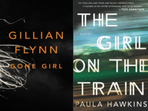
If you want to be completely on trend, then right now the ultra-close up is what’s up. All one needs to do is take a look at the two hottest beachgoer’s novels of the last two summers, “Gone Girl” and “Girl on the Train.” Gone Girl’s ultra-close up is of a piece of hair (or twine… I can’t be sure). Girl on the Train’s ultra-close up is essentially just a window on a train—blurred and whipping past. Both images use their simplicity to capture a sense of tone, but importantly, not plot.
Thus resulted in the final lesson for my book cover. A great modern cover should avoid plot, but is required to project “tone.” This tone places the reader in the mindset of the world they are about to enter—it makes them feel what the characters are feeling.
While designing the second generation of my cover with this in mind, I did come across one more caveat. Self-published books still tend to give just a little bit more away then books published by the Big Five. I have a feeling this is due to the inherent trust that the reader has when it comes to seeing a book on the shelf at their local Barnes & Noble. As a result of this, and since my book was self-published, I completed the design with a few specific guidelines. I intended to give the smallest preview of the book’s setting, but restrict the remainder largely to a feeling. I wanted to keep the cover image simple, and make sure the focus was on only one element. And I wanted to absolutely ace the titling—insuring that every component appeared refined and professional.

It’s beneficial to think about a project from a wider tonal perspective first, then dial-in on the right look, second. That said, there are a million other important points to cover when it comes to design.
One more crucial one: Make sure that your cover downsizes well, ensuring that when it is as small as postage stamp it is still discernible. The wording should be readable. Most importantly, imagine that postage-sized stamp as your only sales representative.